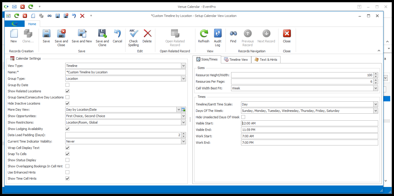
•NOTE: The Sizes and Times options in this edit form will vary, particularly depending on the View Type and Group Type you selected.
•These instructions will describe the various different Sizes and Times options, but remember that you may not see all of the described options, depending on the View Type and/or Group Type. Different settings are applicable to different View Types and Group Types.
•This is a quick reference list of the settings discussed in this topic. Click a link to skip down to that setting.
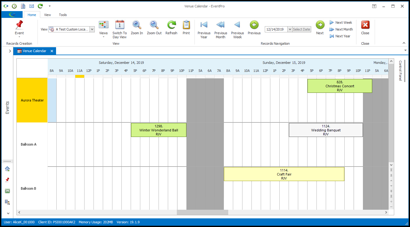
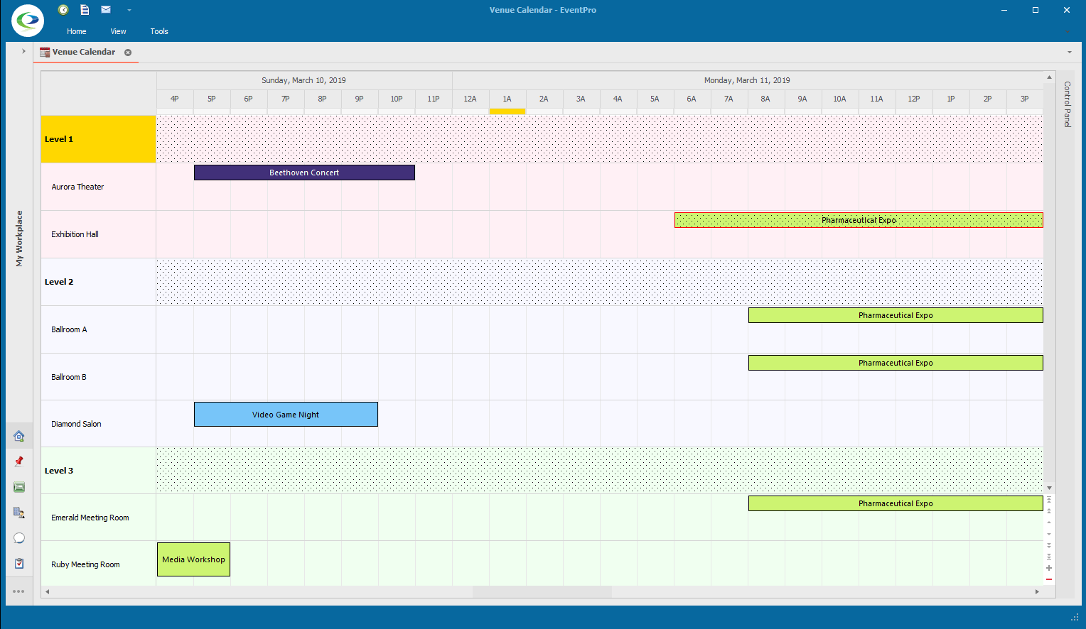
1.Resource Height/Width and Resources Per Page: These fields are activated only if you select a Group Type other than None.
The "Resources" referred to in these field captions are the "Group Type" items by which Event dates are grouped. So, if this view is grouped by Locations, the Locations will be the "Resources"; if grouped by Event Managers, the Event Managers will be the "Resources", and so on.
These two settings control the appearance of the row or column of cells containing Resources.
a.Resource Height/Width: The Resource cells appear along the left column or the top row of the Calendar, depending on the View Type. In this field you can specify the Height (if Resource Cells are in a row) or Width (if the Resource Cells are in a column).
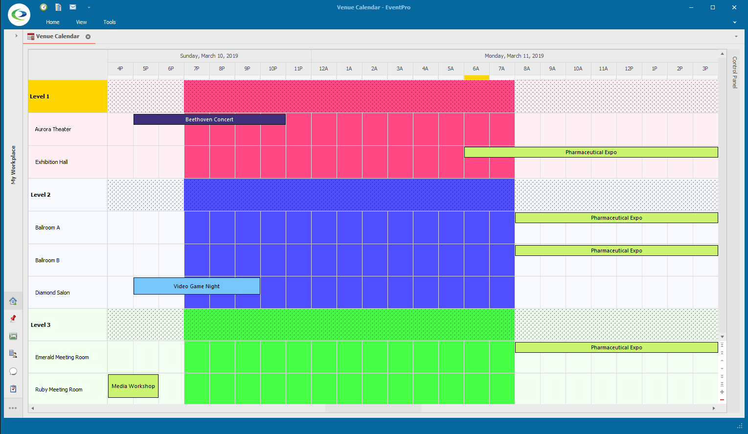
b.Resources Per Page: This determines how many "Resources" - e.g. Locations, Event Managers, Event Statuses, or Event Categories - are visible in the view without scrolling. If you leave this number as 0 (zero), the Calendar will squeeze all of the available Resources onto the screen. (Although, remember that you can still use the Control Panel Filter to hide resources from the calendar view.)
2.Row Height: You can enter a preferred row height, or leave it at zero to let the rows auto-adjust. Note that even if you set the Row Height manually, the calendar view may not be able to respect the setting if it needs to fit a certain number of resources per page.
3.Min Cell Width: You can enter a preferred minimum cell width, or leave it at zero to let the cells auto-adjust. As with the Row Height, even if you set the Minimum Cell Width manually, the calendar view may not be able to respect the setting if it needs to fit a certain number of resources per page.
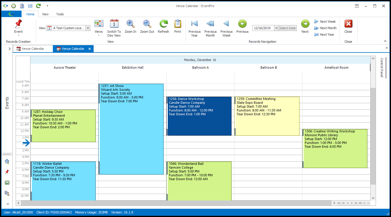
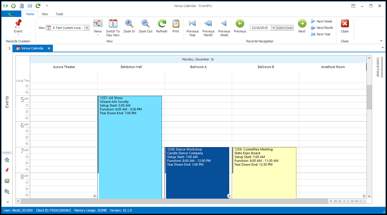
4.Cell Width Best Fit: This field appears if you select Timeline as the View Type.
Choose what type of "Best Fit" you want to use: Month, Week, Day, or Manual.
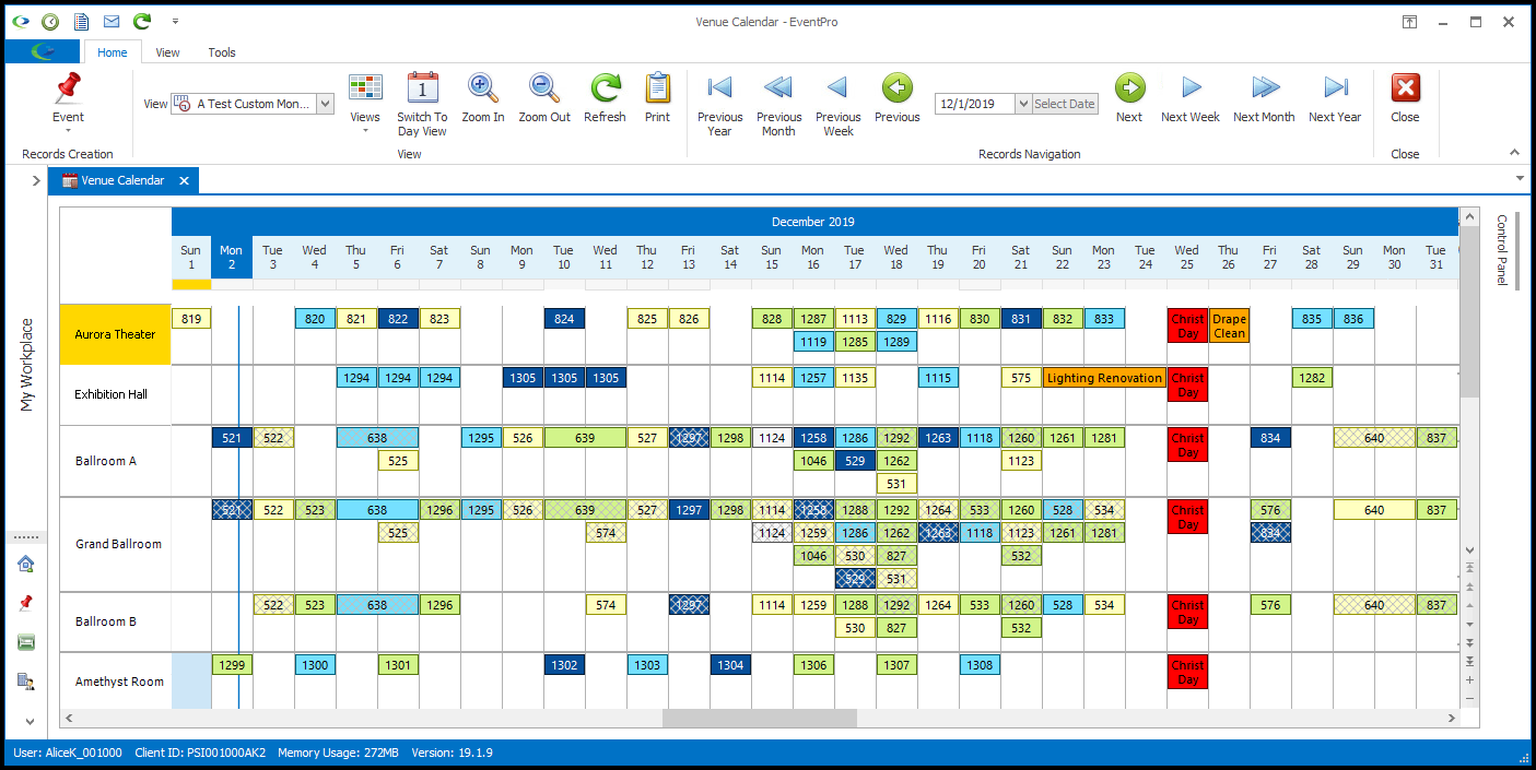
(As noted earlier, a Timeline by Location calendar view is the closest option to the classic EventPro 6 Booking Calendar. Setting the Cell Width Best Fit to Month or Week will closely replicate the classic Monthly and Weekly views, respectively.)
a.Month: Select Month to best fit a Timeline view to a full month, meaning that the Timeline will automatically adjust cell sizes to continue displaying a full Month, even if the window is re-sized.
 Example: Timeline - Month Best Fit
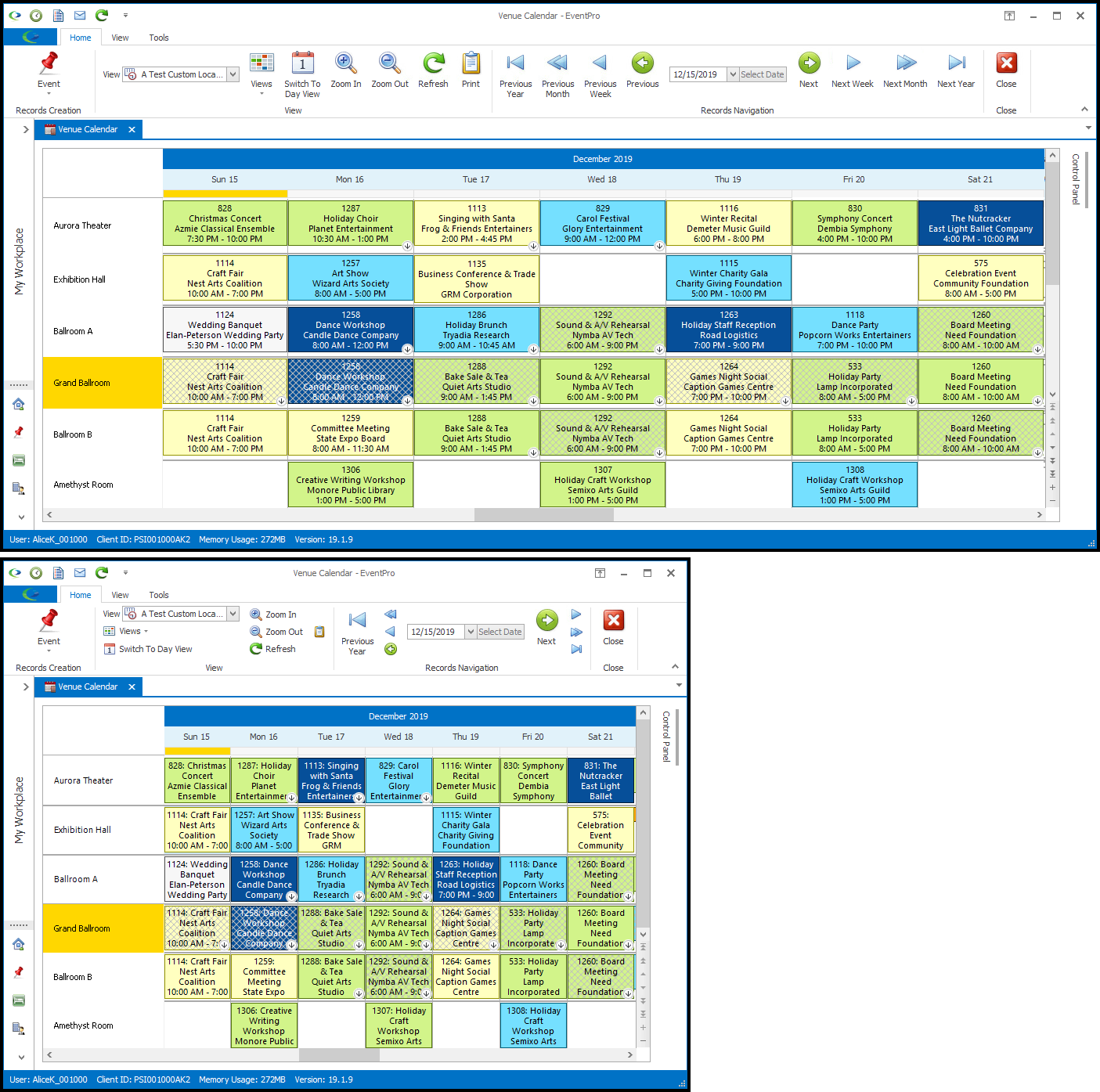
b.Week: Select Week to best fit a Timeline view to a full week, meaning that the Timeline will automatically adjust cell sizes to continue displaying a full Week, even if the window is re-sized.
Example: Timeline - Week Best Fit
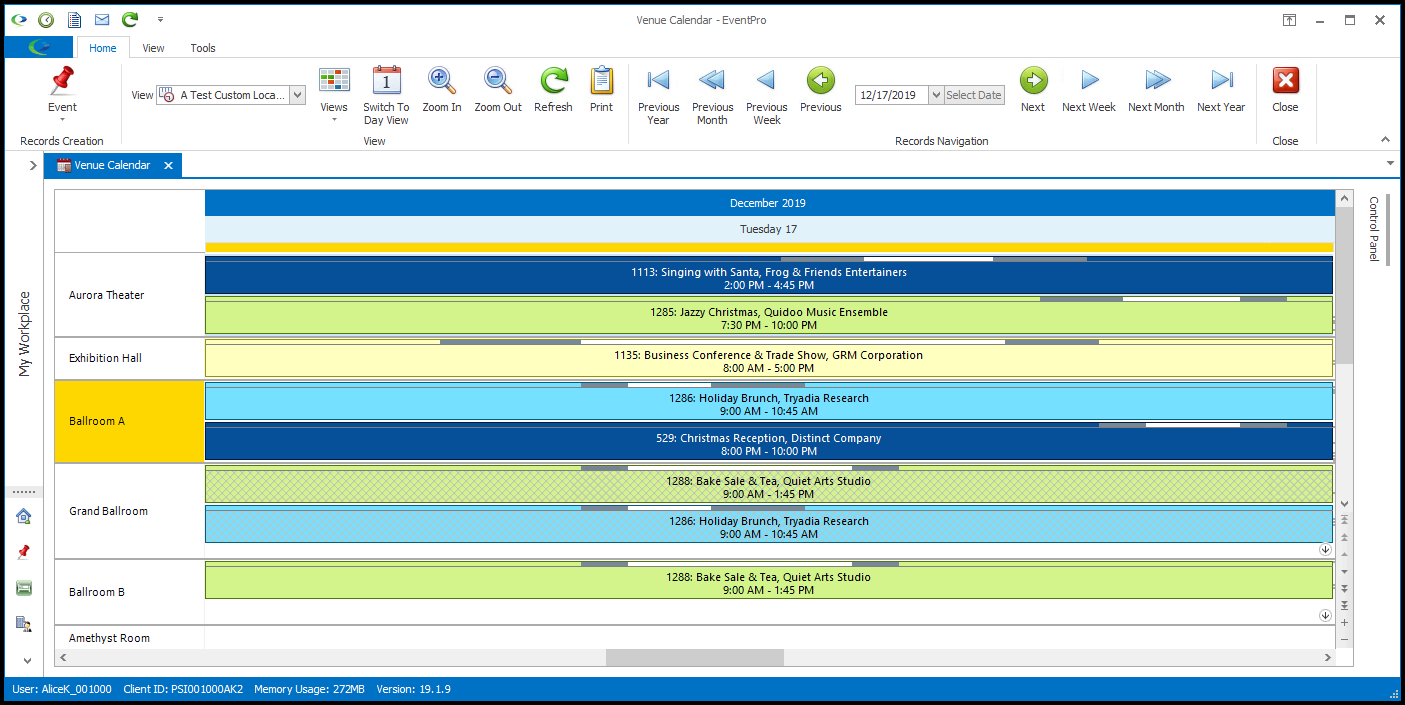
c.Day: Select Day to best fit a Timeline view to a day, meaning that the Timeline will automatically adjust cell sizes to continue displaying a Day, even if the window is re-sized.
Example: Timeline - Day Best Fit
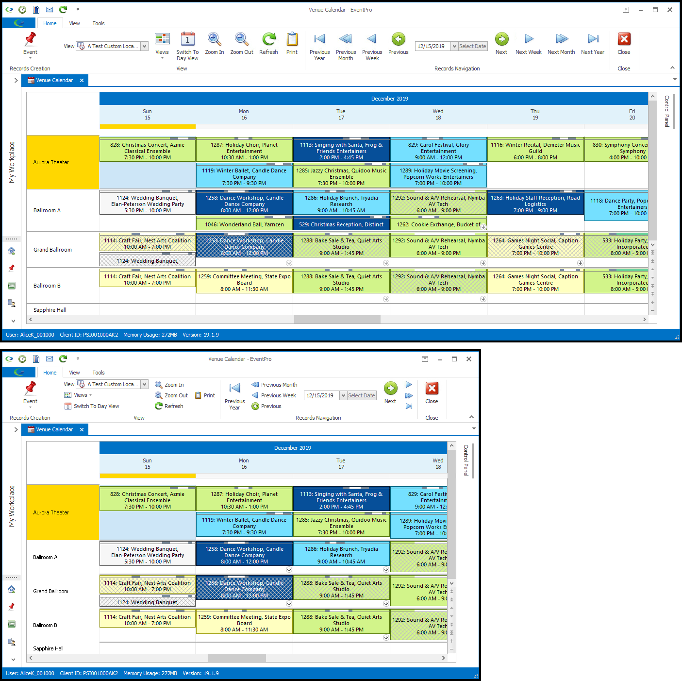
d.Manual and Min Cell Width: If you are less concerned about having a certain number of days displayed, and more interested in keeping the cells larger than a certain size, select Manual, and enter the Min Cell Width below. You will note that the Min Cell Width field only appears if you select the Manual Best Fit option.
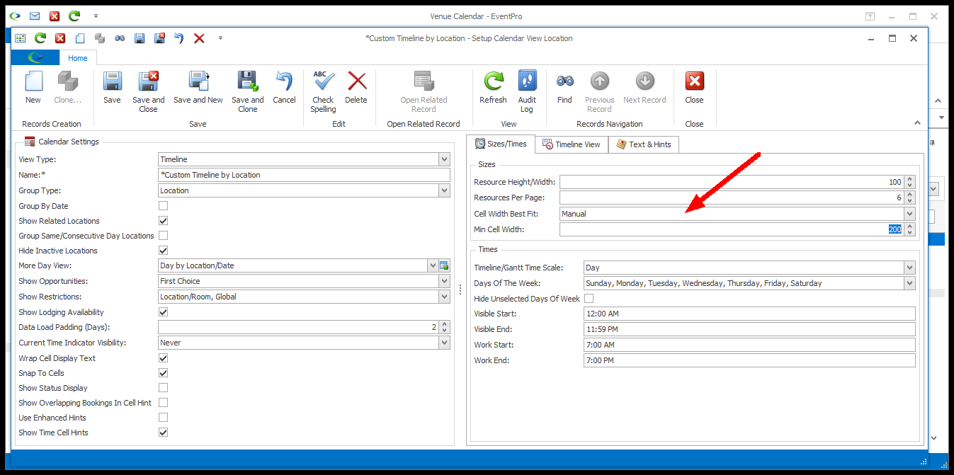
If you manually set the minimum cell width, the number of days displayed on the Timeline may vary if the window is re-sized, since the Timeline will work to keep the cells at minimum width or larger, instead of displaying a set number of days.
Example: Timeline - Manual Fit
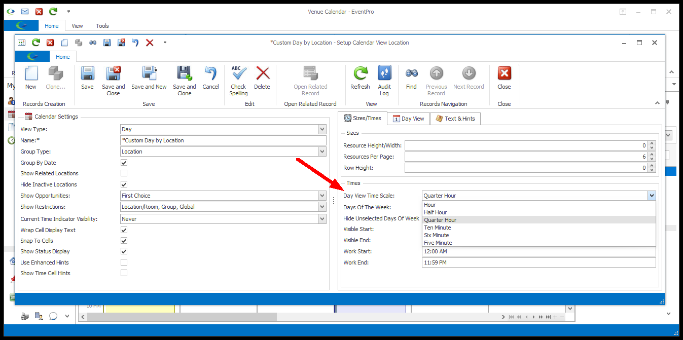
5.Time Scale: The name of this field will vary, depending on the View Type, e.g. Timeline/Gantt Time Scale or Day View Time Scale.
Select the Time Scale you want to use for this view: Day (for Timeline or Gantt only), Hour, Half Hour, Quarter Hour, Ten Minute, Six Minute, or Five Minute.
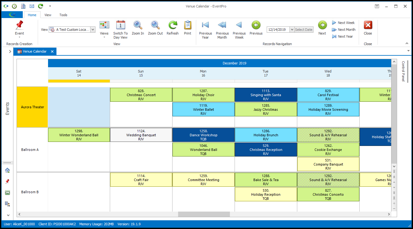
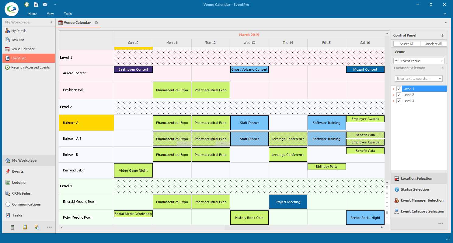
6.Days of the Week: If you want to identify certain days as "Days of the Week", select the checkboxes next to the applicable days from the Days of the Week drop-down, and click OK.
If you choose to leave unselected days visible, they will be identifiable by the darker shade of the background color. You can see examples under the Hide Unselected Days of the Week setting explained below.
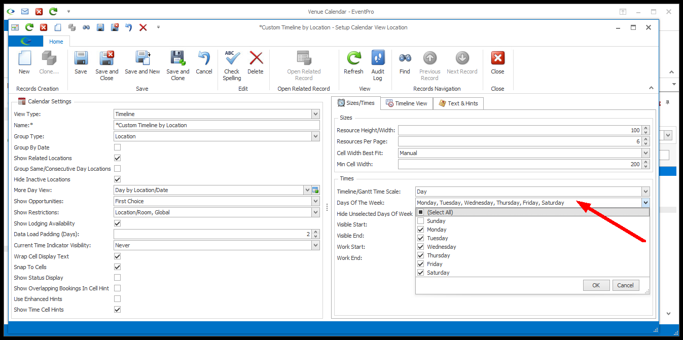
7.Hide Unselected Days of the Week: Select this checkbox if you want the unselected Days of the Week to be hidden in this calendar view.
If you do not select this checkbox, the unselected days of the week will be visible, but in a darker shade of the background color.
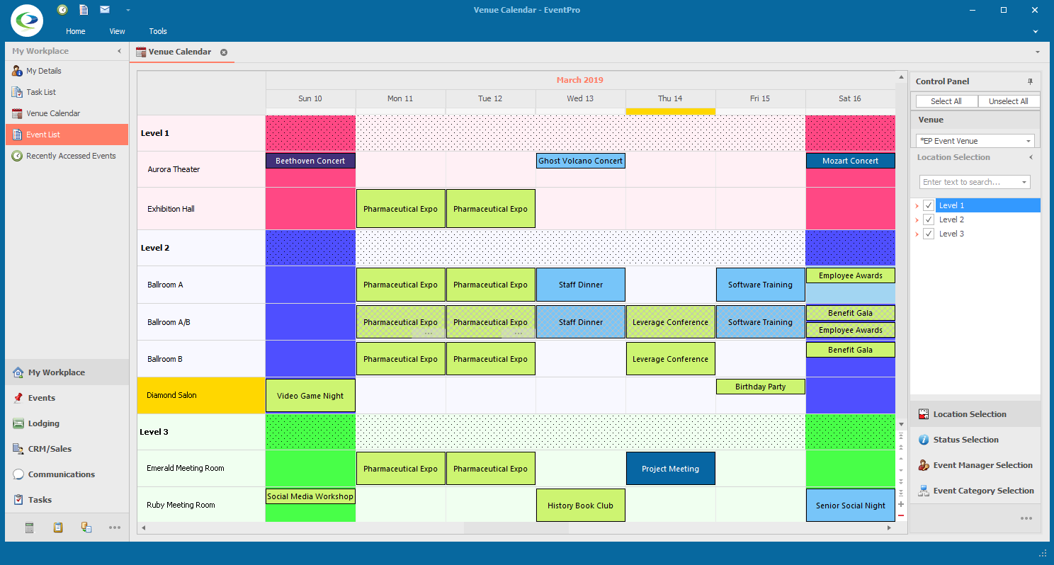
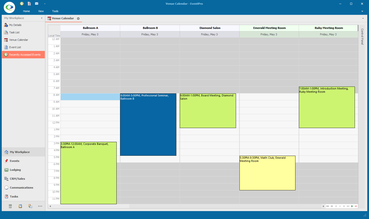
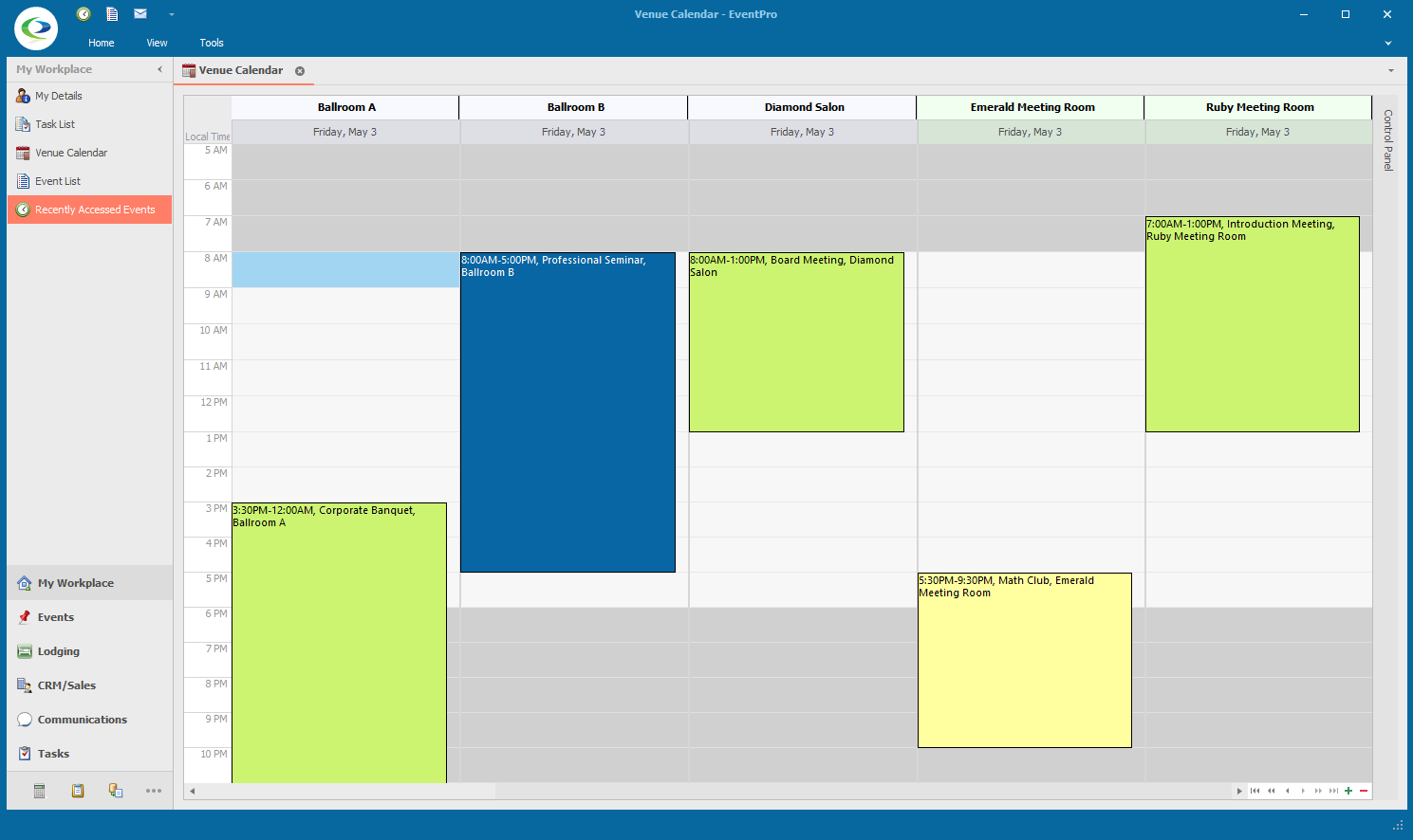
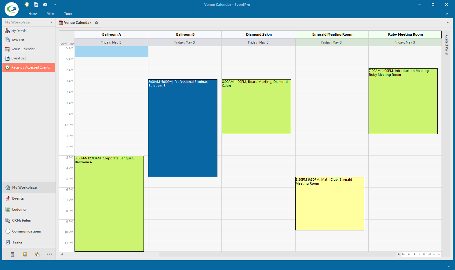
8.Visible Start and Visible End: If this view uses a time scale less than a Day, you can define Visible Start/End times.
In the Visible Start and Visible End Time fields, enter the time range you want visible in the calendar view.
If the Work hours (next setting) are shorter than the Visible hours, you will see that the visible non-work hours appear in a darker shade of the background color. You can view some examples after the explanation of the Work Start/End settings below.
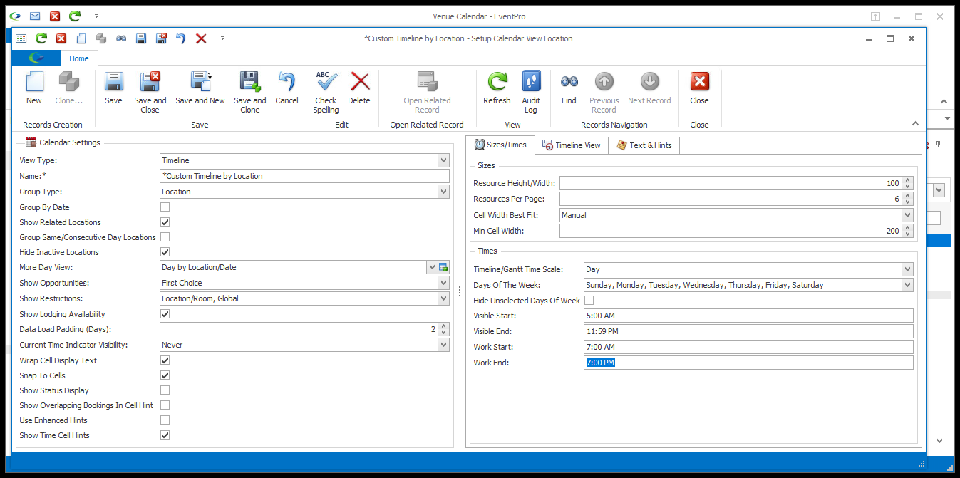
9.Work Start and Work End: Enter the time range of your working hours in the Work Start and Work End Time fields. These could be the same as the Visible hours, or shorter, depending on your organization. If the Work hours are shorter than the Visible hours, you will see that the non-work hours appear in a darker shade of the background color.
10.To see a few more examples of these Week Days and Visible/Work Times settings, click the heading below.
Next, you can adjust the settings under the View tab. See View for Type.