EventPro's integrated Pivot Grid Charts allow you to display the summarized information in a variety of formats, including bar graphs, stacked bar graphs, pie charts, line graphs, and many more.
For our sample chart, we will be using the same Pivot Grid example that we created above.
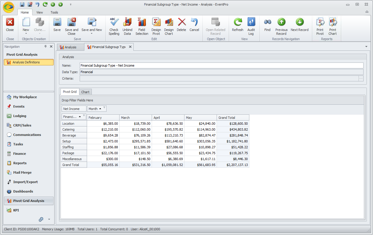
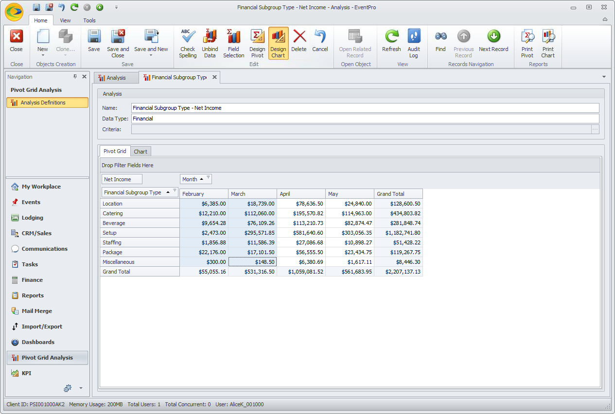
1.We already have our Pivot Grid created for Monthly Net Income by Financial Subgroup Type.
In order to make our Pivot Grid/Chart more streamlined and compact, we filtered the Months to display only February, March, April, and May, and filtered the Financial Subgroup Types to display only Location, Catering, Beverage, Setup, Staffing, Package, and Miscellaneous.
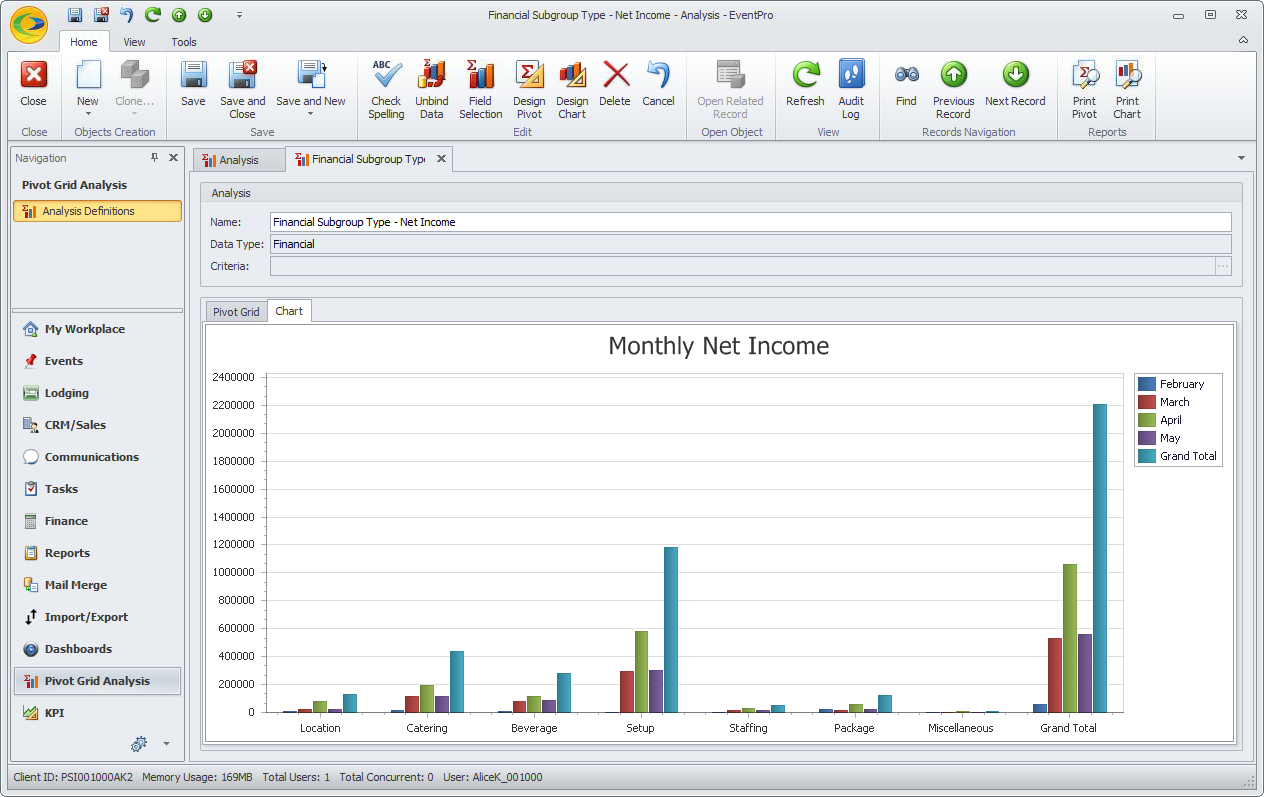
2.Without doing any extra work, there is already a default chart created for the Pivot Grid.
Click the Chart tab next to the Pivot Grid tab.
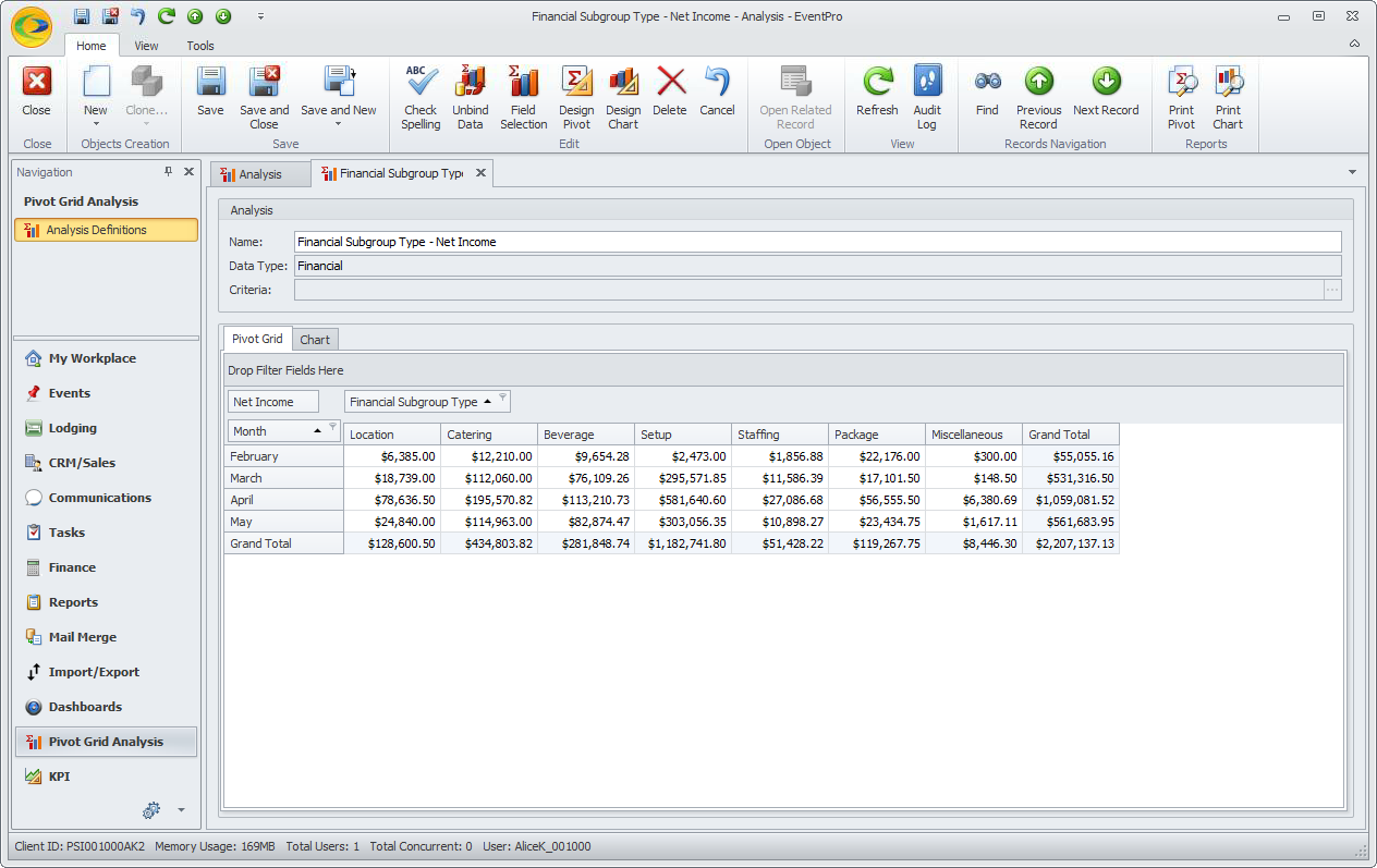
3.To get another perspective on the data, return to the Pivot Grid, and switch the Month and Financial Subgroup Type fields in the layout.
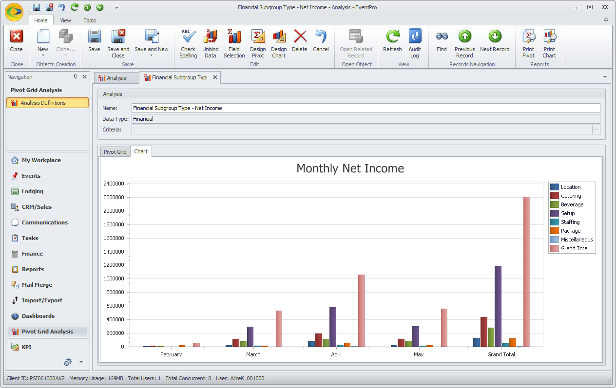
Return to the Chart tab, where you will see that it has adjusted to the new data layout.
4.This is a convenient quick-view of the data, but you can also customize the Chart so that it is useful for your analysis needs. There are numerous options available in the chart designer to create the visualization you want.
We will now customize our chart.
5.Return to the Pivot Grid tab.
In our example, we are going to switch the layout back so that Financial Subgroup Type is in the Row area, and Month is in the Column area.
6.Click the Design Chart button in the top navigation ribbon.
7.The Chart Wizard appears.
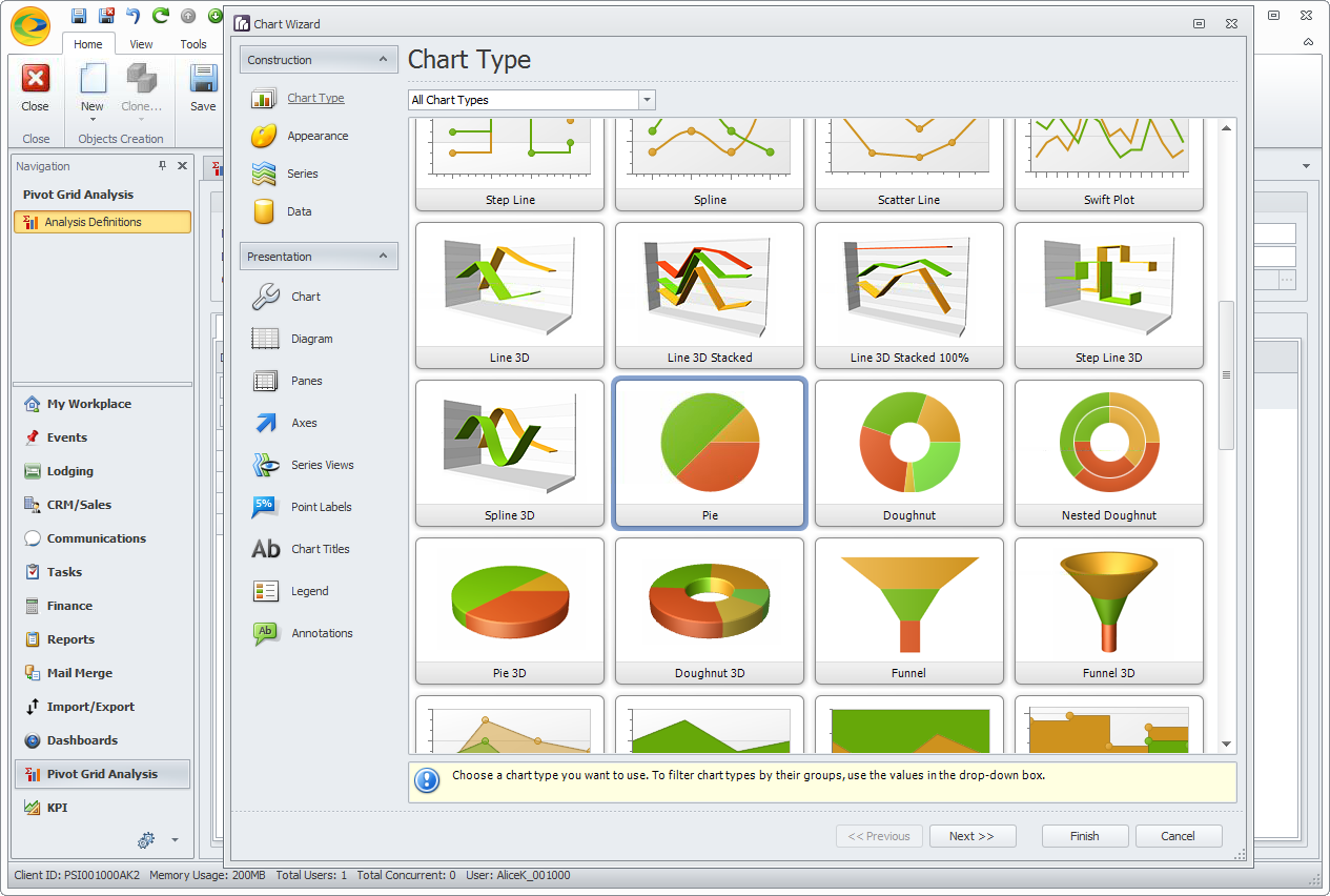
a.If you look along the left menu column, you will see the pages of the Chart Designer Wizard, grouped under Construction and Presentation:
i.Construction: Chart Type, Appearance, Series, and Data.
ii.Presentation: Chart, Diagram, Panes, Axes, Series Views, Point Labels, Chart Titles, Legend, and Annotations.
b.If you click the Next button, the Chart Wizard will work its way down the options under Construction and Presentation in the left menu column.
c.However, if you only want to customize a few specific elements of the chart, you do not need to go through the entire wizard. It is not necessary to customize the entire chart if you are satisfied with some of the default options.
To go directly to a certain wizard page, simply click the menu option on the left.
d.You can click Finish at any time to complete your chart customization, and view the chart preview.
e.You can also return to the wizard at any time to make adjustments by clicking the Design Chart button again.
8.In our example, we are first selecting the Chart Type. We selected a Pie chart.
If you want to narrow down the number of chart types visible, use the top drop-down to display charts by Type.
After you select a Chart Type, click Next, or click on Appearance in the left column.
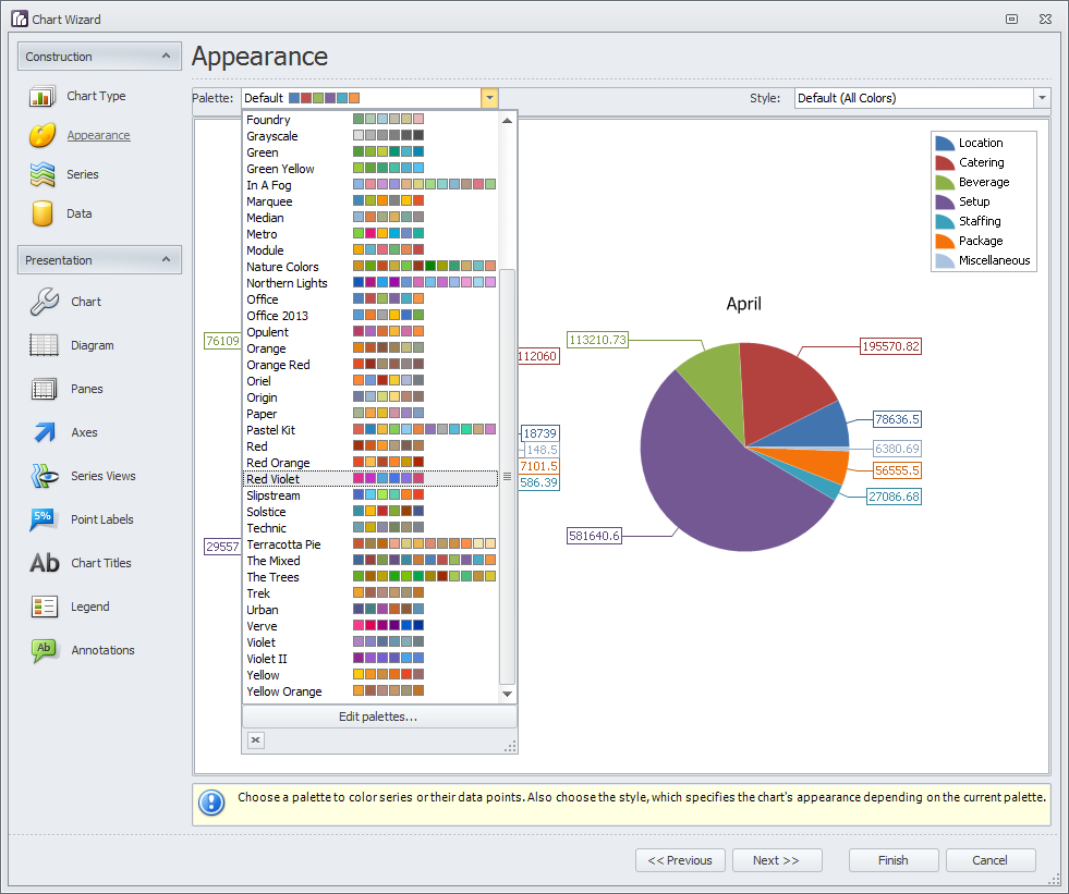
9.In the Appearance wizard page, we selected a new color Palette.
If you click the drop-down, you will see that there are numerous color schemes, plus you can create your own under Edit Palettes.
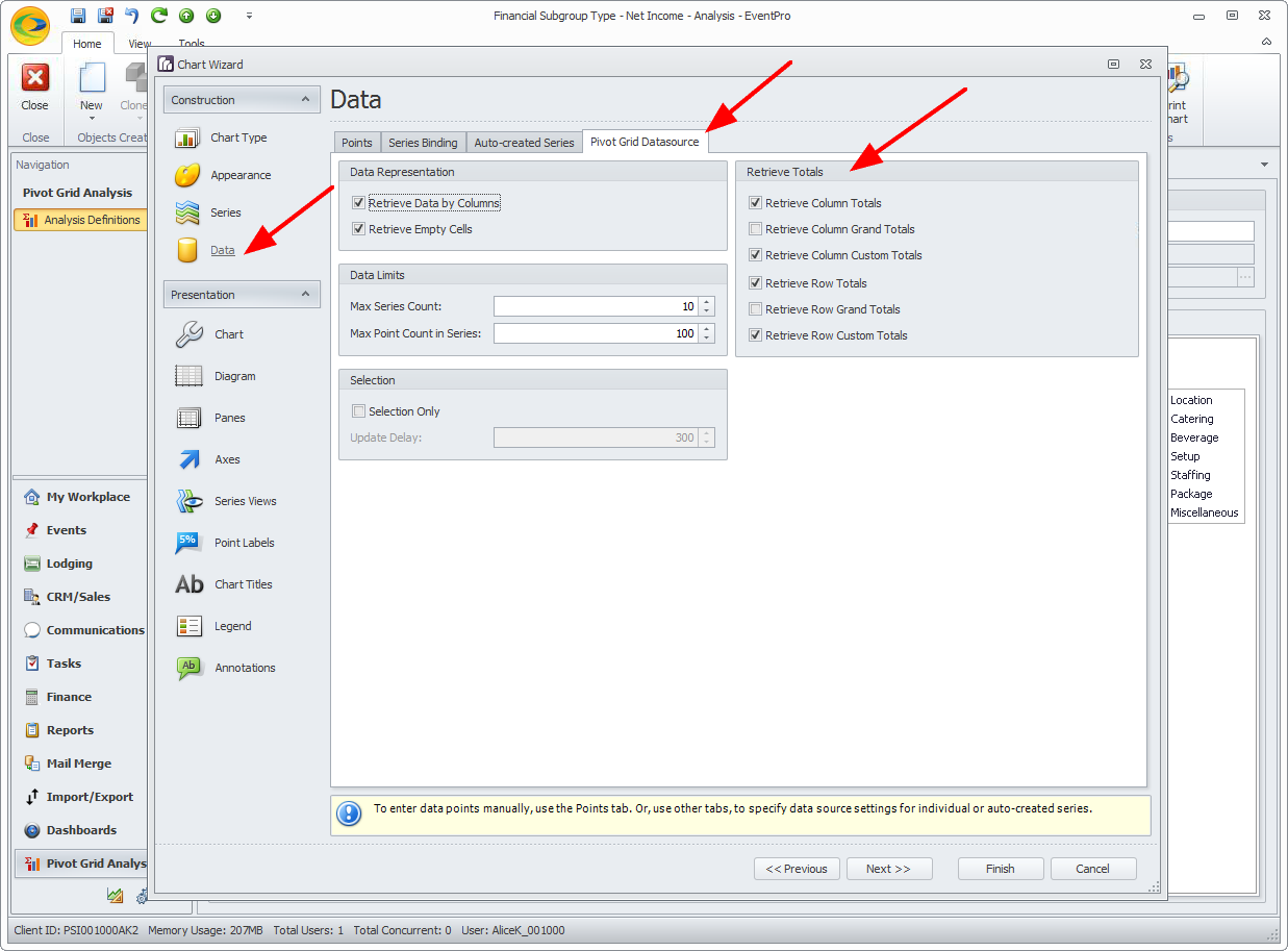
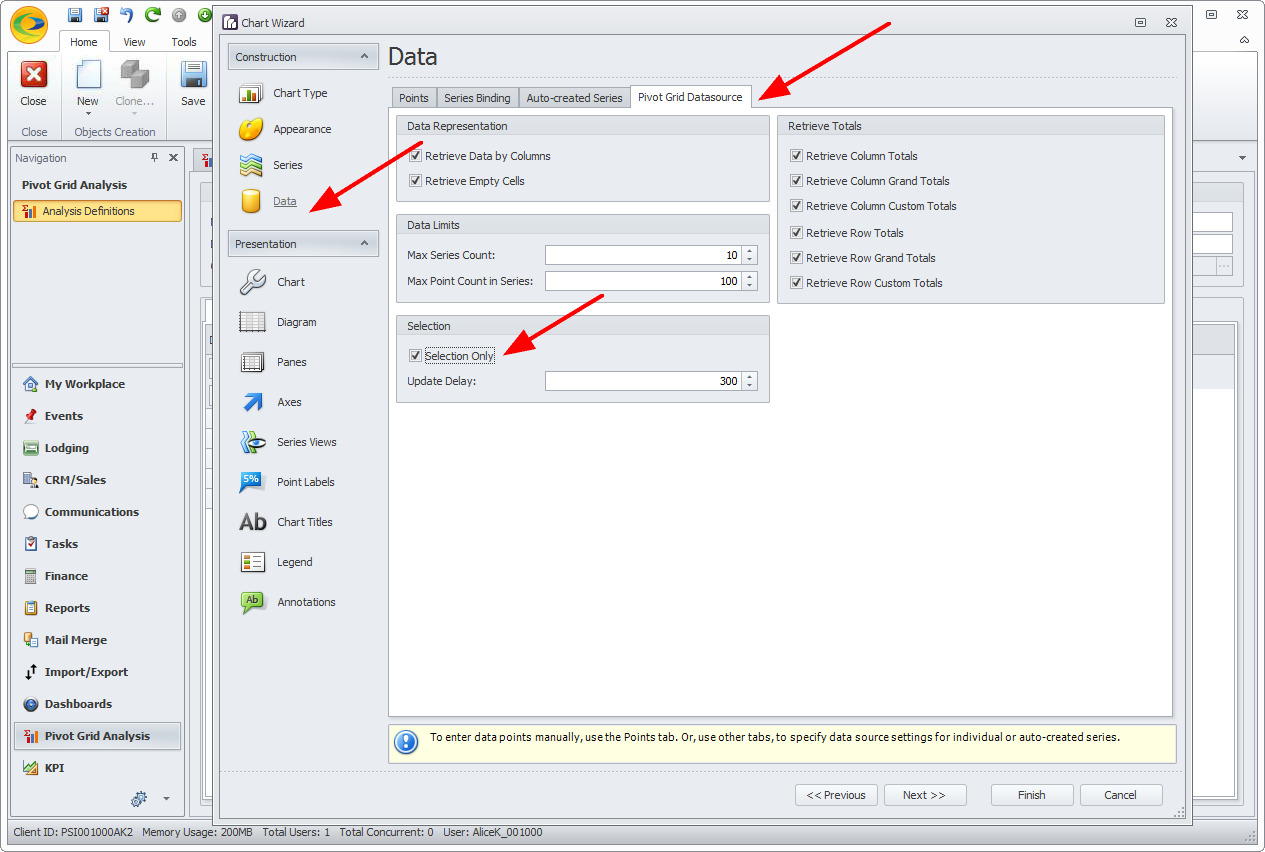
10.Next, we have skipped over Series, and we are now on the Data options page.
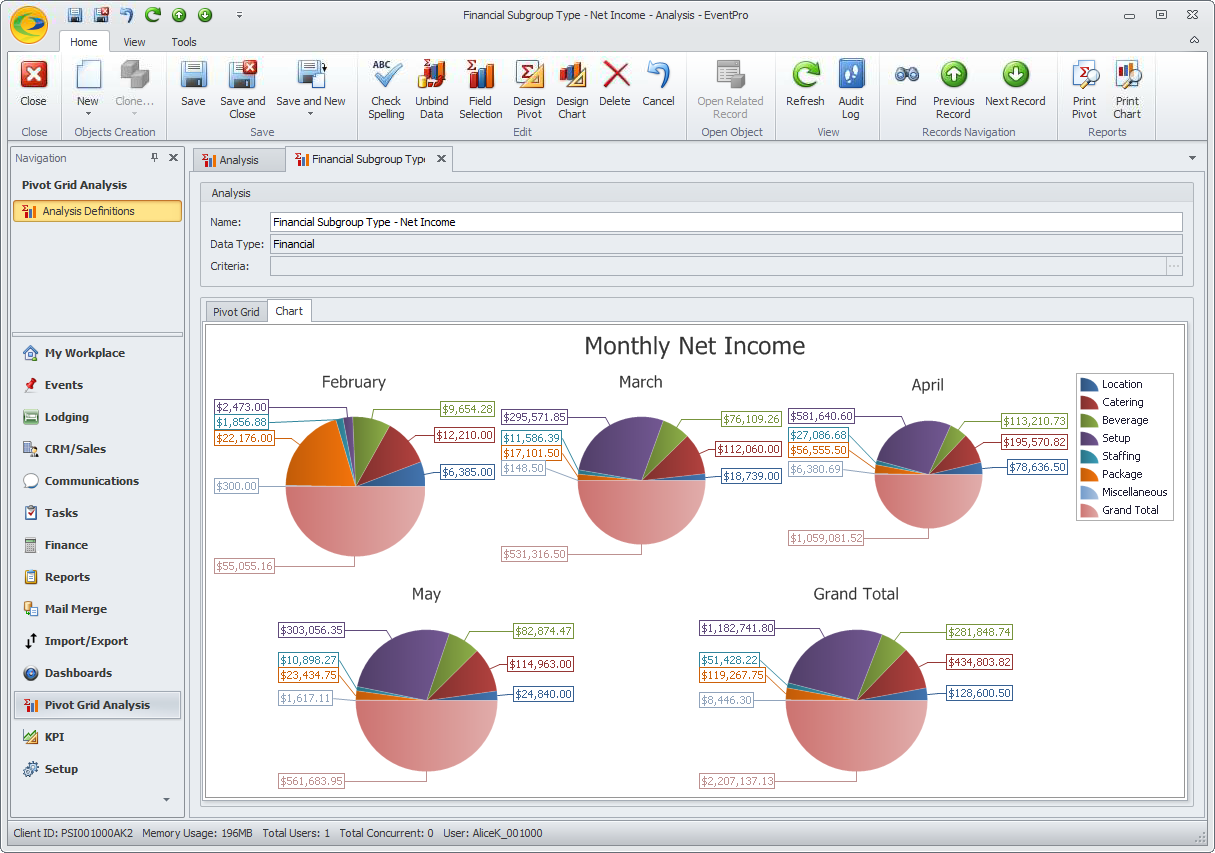
Hiding Grand Totals: In the Pie Chart we are creating for this example, we do not want to include the Grand Totals, because we want to see how the Financial Subgroup Types compare to each other, i.e. how much of the pie each Financial Subgroup Type fills. The Grand Totals will throw off the Pie Chart appearance for our purposes.
There are a few different ways of hiding the Grand Totals from your final Chart:
a.First, you may have already hidden the Grand Totals for the data fields in the Pivot Grid. If the Grand Totals are already hidden, you don't need to worry about this step.
b.Alternatively, you can tell the Chart to not retrieve the Grand Totals. As a result, the Pivot Grid will still show the Grand Totals, but they won't be pulled into the Chart.
In the Data page, go to the Pivot Grid Datasource tab.
Under Retrieve Totals, unselect the checkboxes next to the Total(s) you don't want to see in the Chart, depending on how your Pivot Table is set up and what results you want to see. You can try out different options and return to make changes in the Chart Wizard if necessary.
In our example, we have unchecked Retrieve Column Grand Totals and Retrieve Row Grand Totals.
c.You can also adjust the chart so that it only shows selected cells.
In the Data page, go to the Pivot Grid Datasource tab.
Under the Selection group box, click the Selection Only checkbox. Later, when you view the chart, you will need to first select a set of cells in the Pivot Grid.
d.Alternatively, you can a
e.If it happens that you want all the Pivot Grid data to appear in your chart, including Grand Totals, you don't need to do this step.
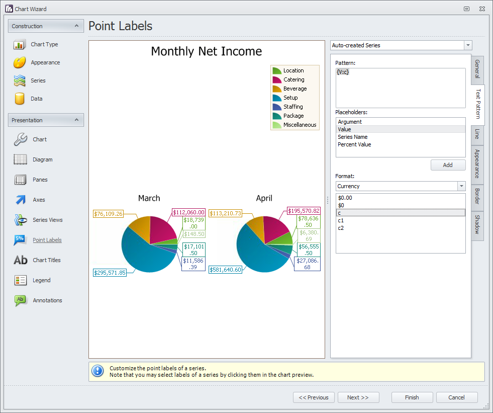
11.Next, we will skip over to the Point Labels page. Click Point Labels in the left column.
a.Because our chart is displaying income numbers, i.e. money, we want the Point Labels to be formatted for currency.
b.On the Point Labels page, click the vertical Text Pattern tab on the right.
c.Under Placeholders, select Value and click Add. The text {V} will appear in the Pattern memo box.
d.Now, under Format, select Currency from the drop-down, and double-click on the Currency Format you want to use below. The text in the Pattern memo box will now read {V:c2}, or whatever you selected for the Currency Format.
i.Note that "c", "c1" and "c2" are standard Currency Format Specifiers that use the currency symbol defined by your regional settings, e.g. $ for en-US, or £ for en-UK.
ii.The "c" specifier uses the default number of decimal digits from the regional settings, which for en-US and en-UK would be 2.
iii.The specifier "c1" displays 1 decimal digit, and "c2" displays 2 decimal digits (so "c" and "c2" would display the same results for en-US regional settings, for example).
e.The preview charts will display the Point Labels in the new formatting you selected.
You can make other changes to the Point Labels - font, text size, line style, fill color, etc. - using the vertical tabs alongside Text Pattern: General, Line, Appearance, Border, and Shadow.
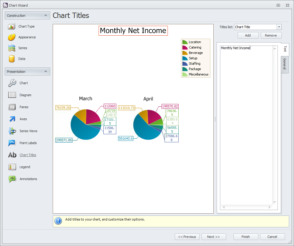
12.Finally, the last thing we want to add is a Chart Title. Go to the Chart Titles page.
a.Just under the Titles List drop-down in the upper right corner, click the Add button.
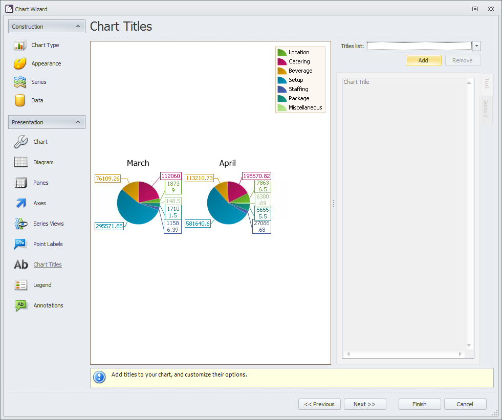
b.In the text area of the Text tab below, type in your chart title. We have called our chart "Monthly Net Income".
If you want, you can change the title's font, alignment, etc. under the General tab along the right side, just under the Text tab.
13.Click Finish. You will return to the Pivot Grid.
As you probably noticed, there were many other edits we could have made in the pages we looked at, as well as the options we skipped over.
For now, however, we will proceed with our Pie Chart as is. Remember that you can always return to the Chart Designer to make more changes.
14.Click the Chart tab to view your newly designed Pie Chart.
15.Now, depending on how you dealt with Grand Totals earlier, your Chart may look different.
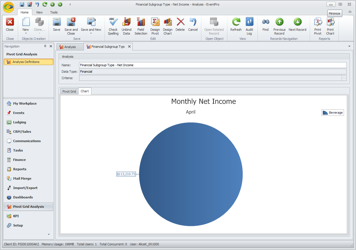
a.If you have hidden the Grand Totals by editing the field's properties in the Pivot Grid Designer, or by unchecking the "Retrieve Column/Row Grand Totals" settings in the Chart Wizard, your Pie Charts will looking something like this:
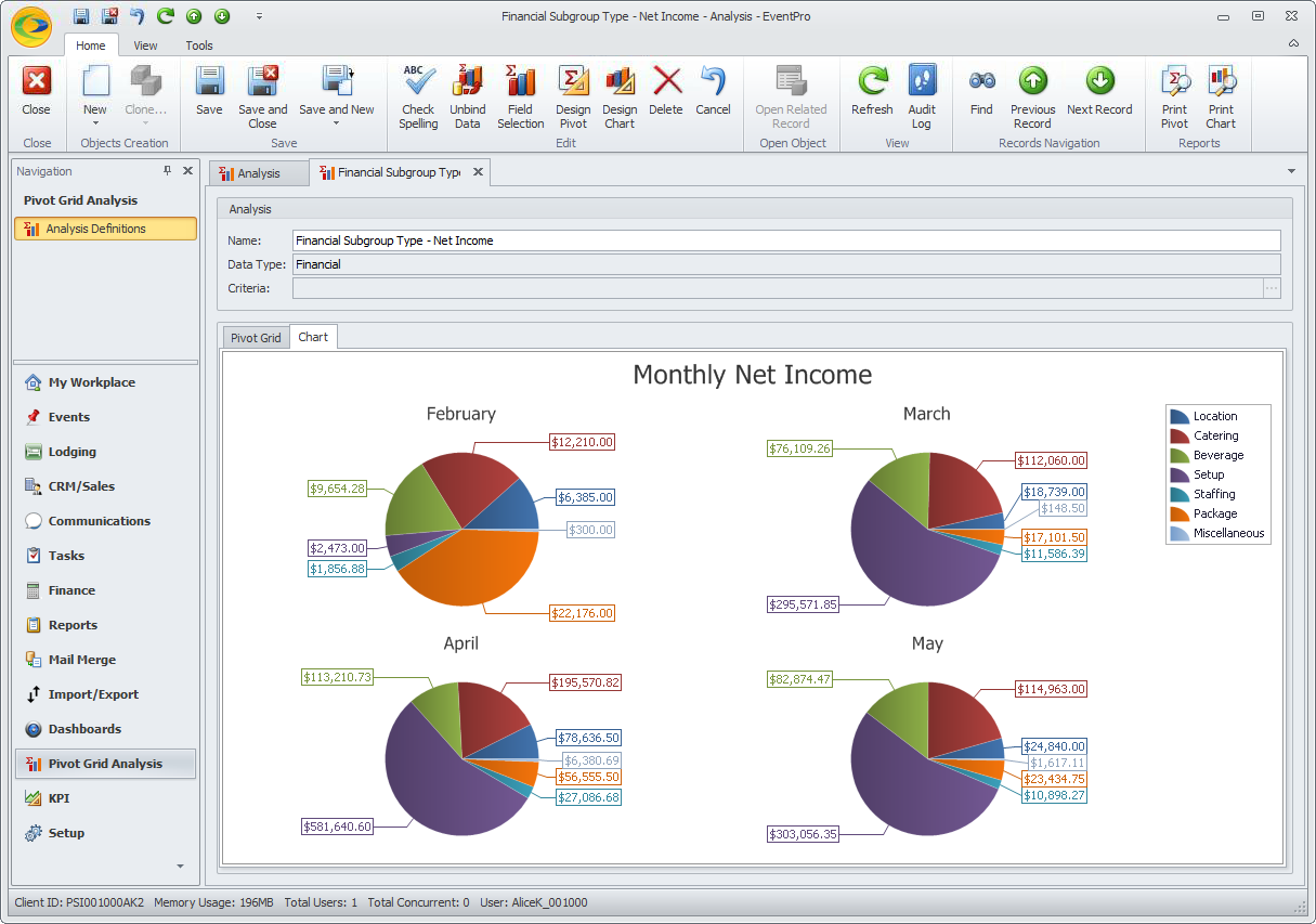
b.If you did not hide the Grand Totals in one of the ways described above, they will appear in your Pie Charts - something like this:
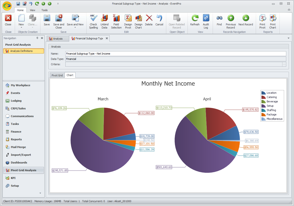
c.If you set the Pie Chart to only display selected cells, you need to first select the relevant Pivot Grid cells before opening the Chart tab.
For example, if we select the cells for all Financial Subgroup Types in March and April, but not the Grand Totals...
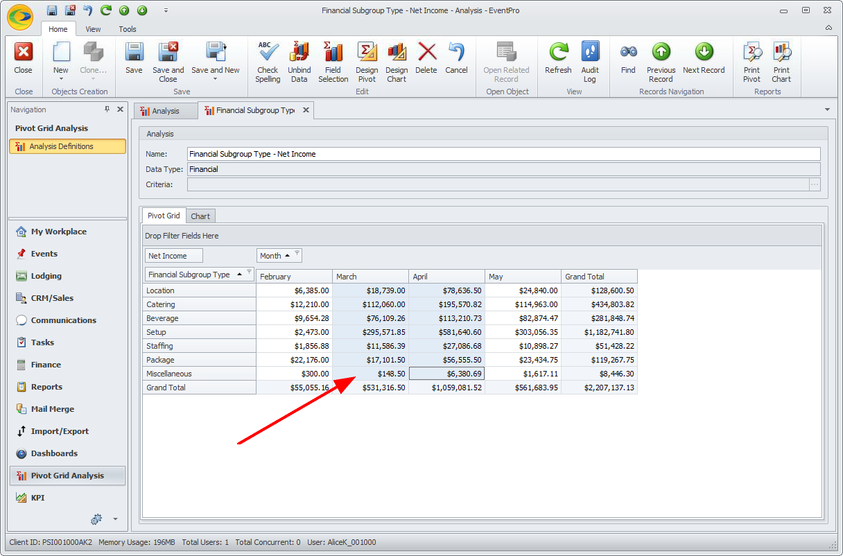
... the resulting chart looks like this:
If we select all Pivot Grid cells, except Grand Totals, the chart looks like this:
If you forget to select cells in the Pivot Grid, your Pie Chart will only display the one cell that you happen to be resting on.
16.Ensure that you Save your Pivot Grid Analysis, including your customized Chart, by clicking the Save or Save and Close button in the top navigation ribbon.