1.Click the Chart button to add a new Chart to the designing area.
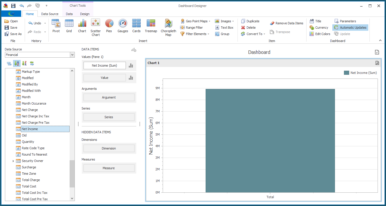
2.Drag-and-drop the data field you want to use for the chart's Values.
Once again, we are looking at Net Income in our example.
3.For the Argument, we are going to add the Month data field.
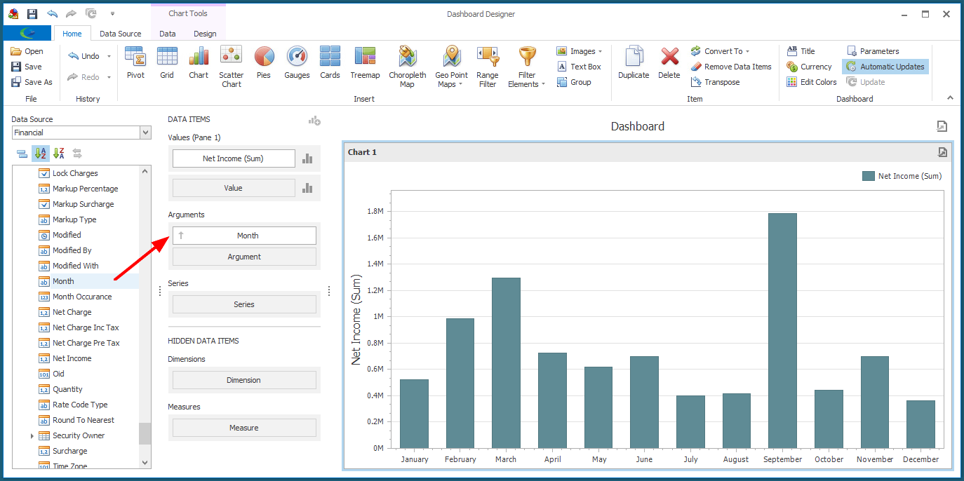
We could leave the Chart like this, if that is the information we want displayed.
In our example, though, we are going to add more information.
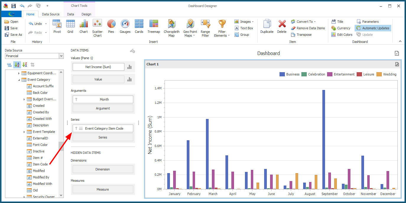
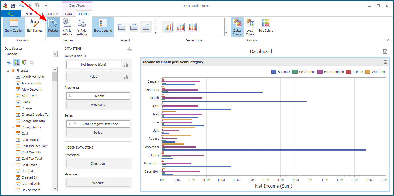
4.Next, we are going to use the Linked Event > Event Category > Item Code field for the Series.
We can now see how the Net Income from different Event Categories fluctuates over the months.
5.You can review how to change the Chart's captions in Design Dashboard Item.
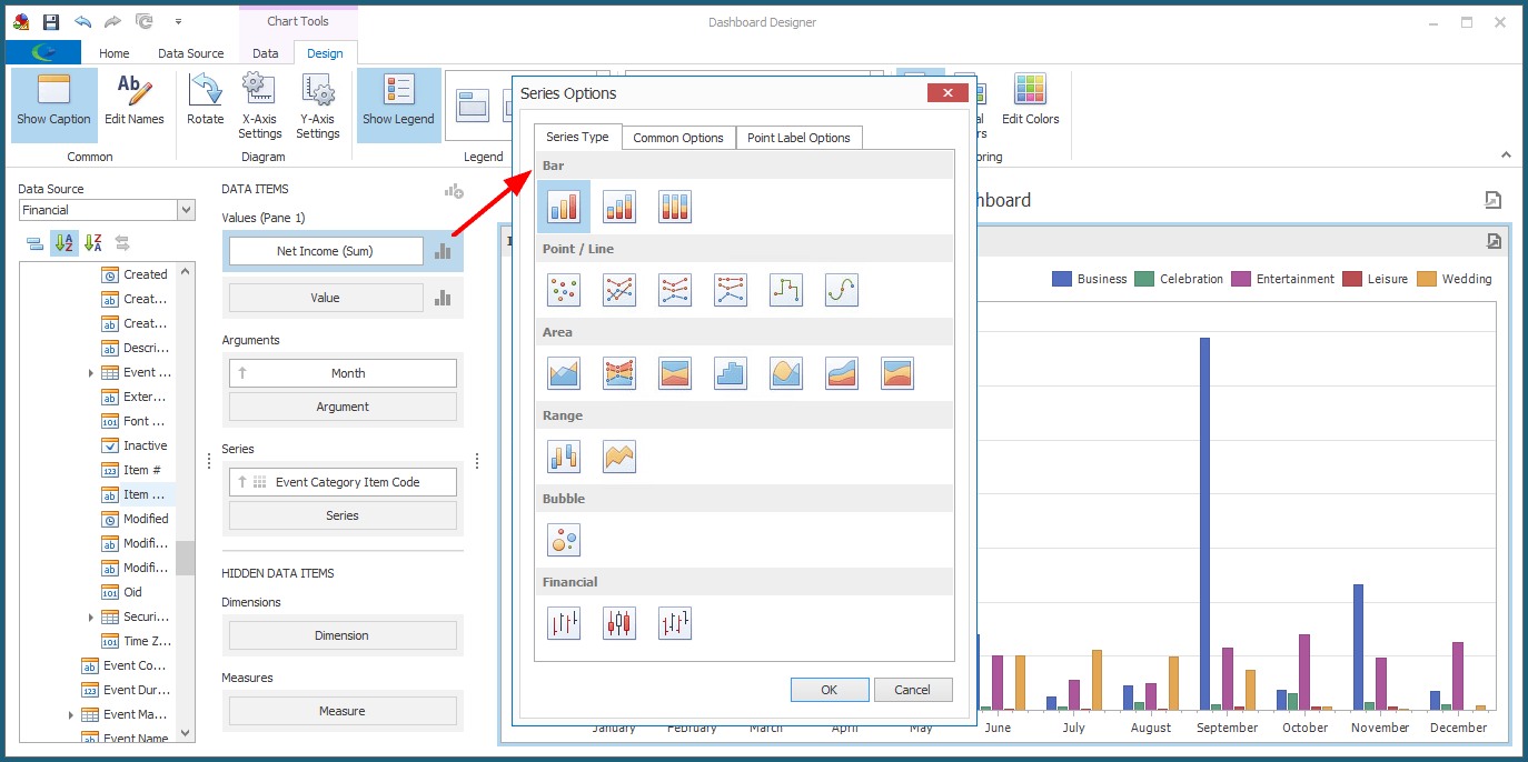
6.The chart will use Bars by default, but you can choose a different chart type and change some other settings in the Series Options dialog.
Click the Chart icon next to the Net Income Value data item.
The Series Options dialog appears.
a.Series Type: Select the type of chart from various options under Bar, Point/Line, Area, Range, Bubble, and Financial.
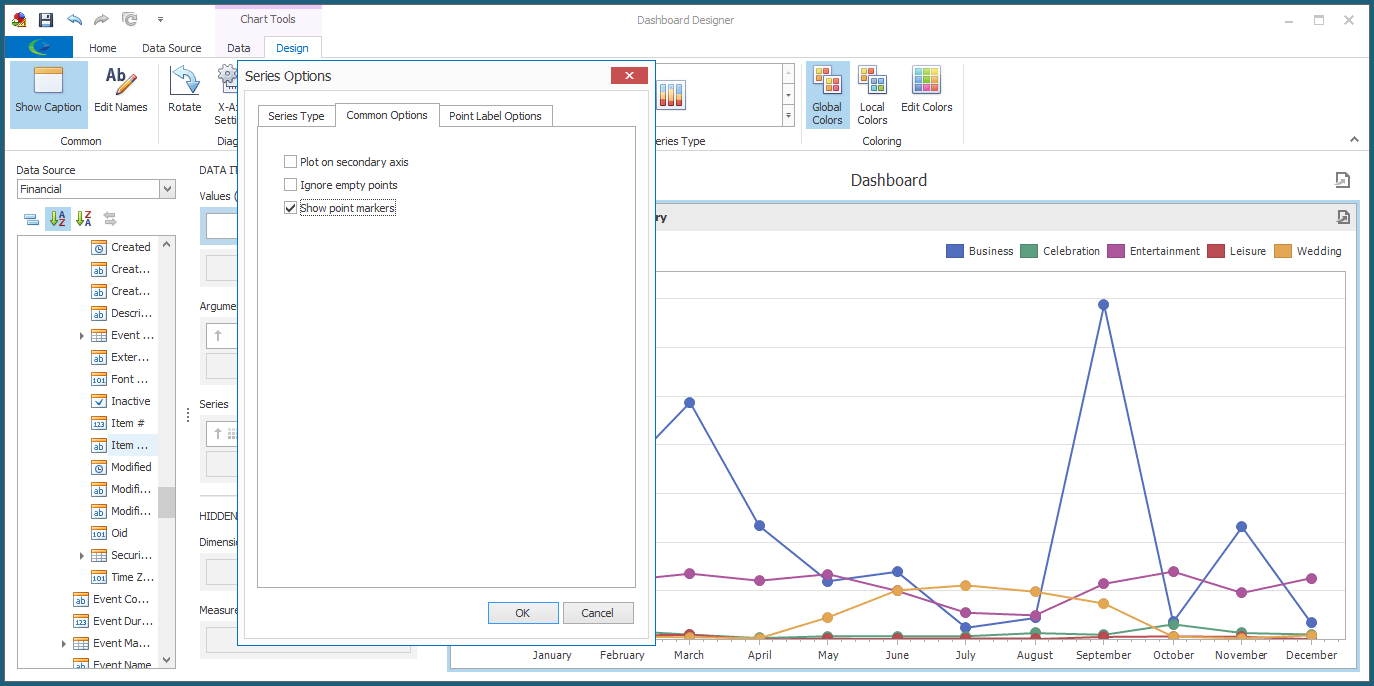
b.Common Options: These options will vary, depending on the Series Type selected.
c.Point Label Options: Select the checkbox if you want to Show Point Labels. You can then adjust the Content, Overlapping Mode, and Orientation of the point labels.
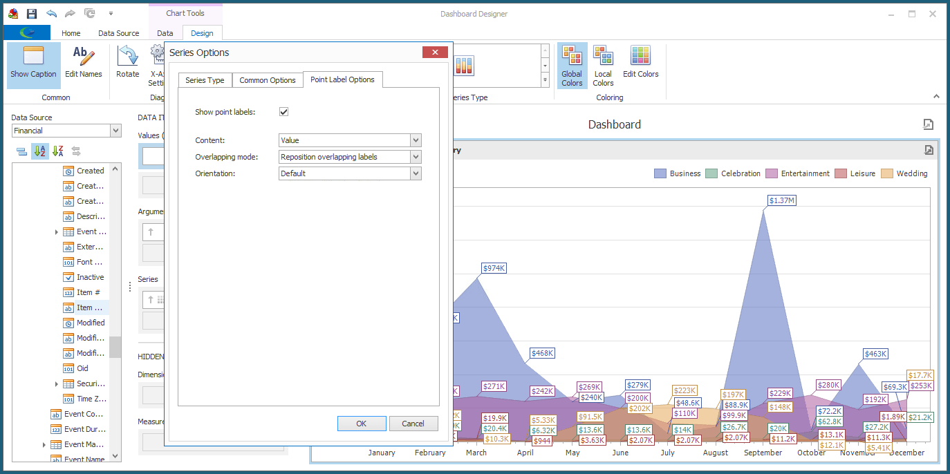
d.When you are done with the Series Options dialog, click OK.
7.We will now go to the Design tab of the top ribbon, where we can access Design Tools for Charts.
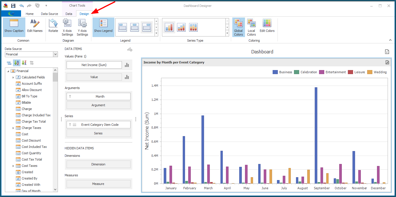
As you will recall from Design Dashboard Item, the Design Tools will vary depending on the type of Dashboard Item, although Show Caption and Edit Names will be common to most types.
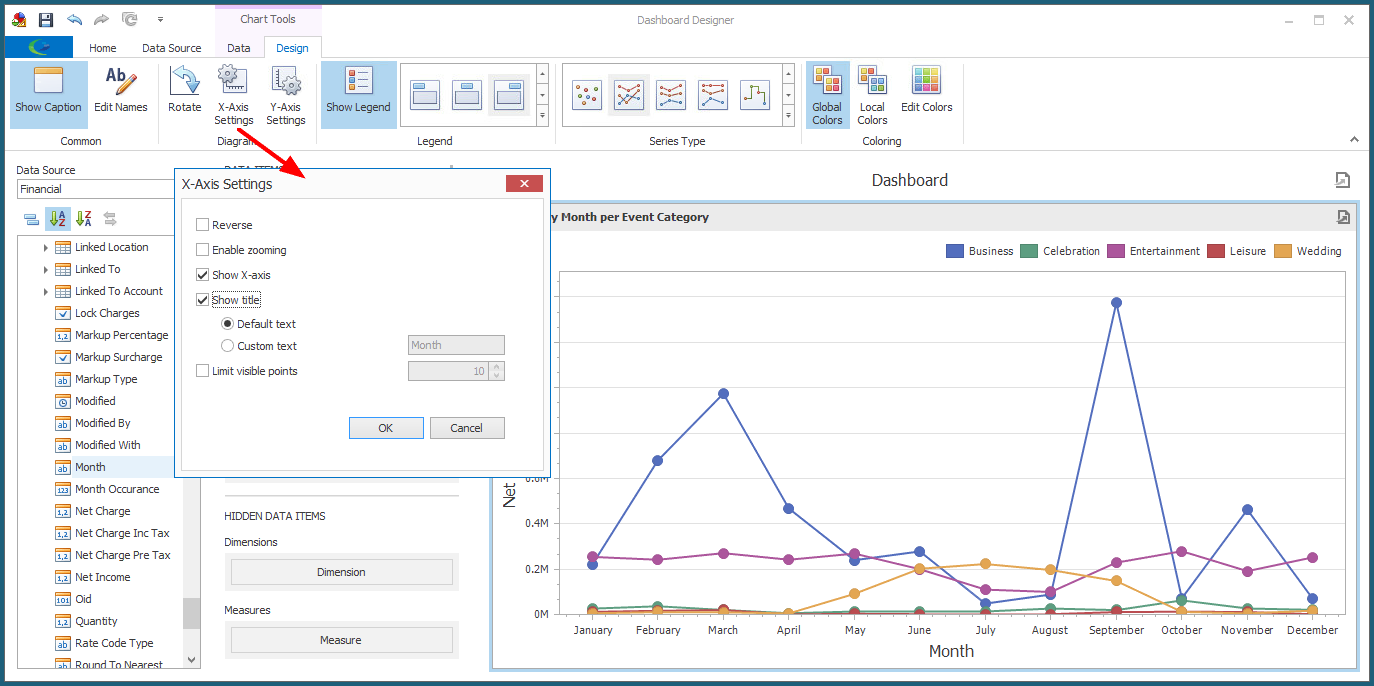
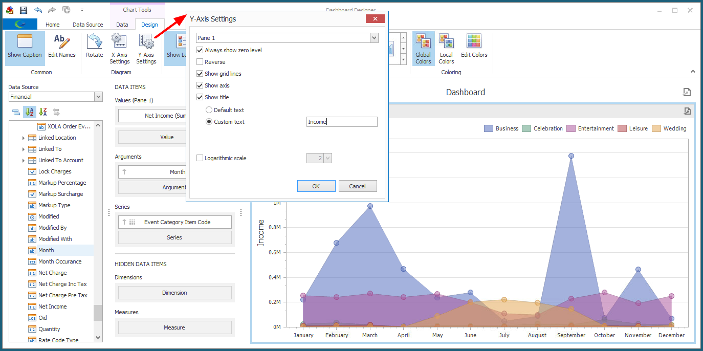
a.Diagram: These commands allow you to adjust settings related to the X Axis and Y Axis.
i.Rotate: Click this toggle button to rotate the diagram 90 degrees, and click again to return to the original position.
ii.X-Axis Settings: Click this button to open the X-Axis Settings dialog.
iii.Y-Axis Settings: Click this button to open the Y-Axis Settings dialog.
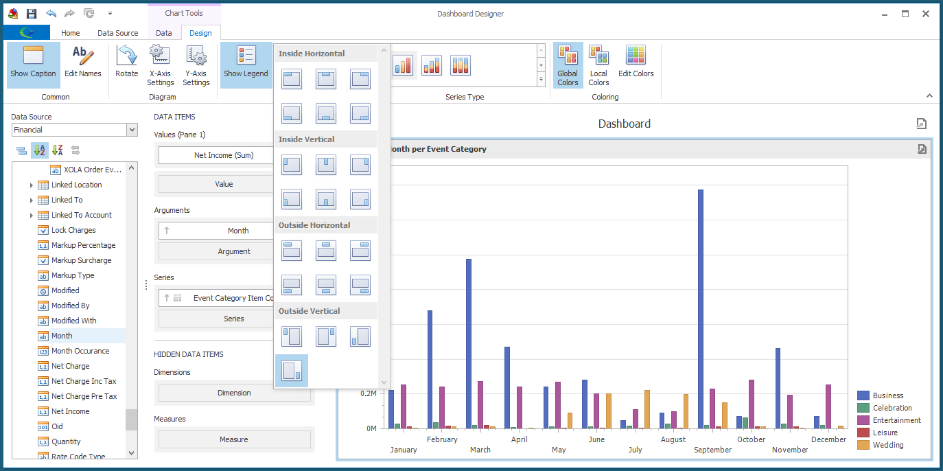
b.Legend: Click the Show Legend button to toggle between showing and hiding the color-coded Legend.
If the Chart shows the Legend, you can select the position and orientation of the Legend from the drop-down list. There are various options under Inside Horizontal, Inside Vertical, Outside Horizontal, and Outside Vertical.
c.Series Type: You can select the series types you want to use from the drop-down list, which has various options under Bar, Point/Line, Area, Range, Bubble, and Financial. These are the same options contained in the Series Options dialog described above.
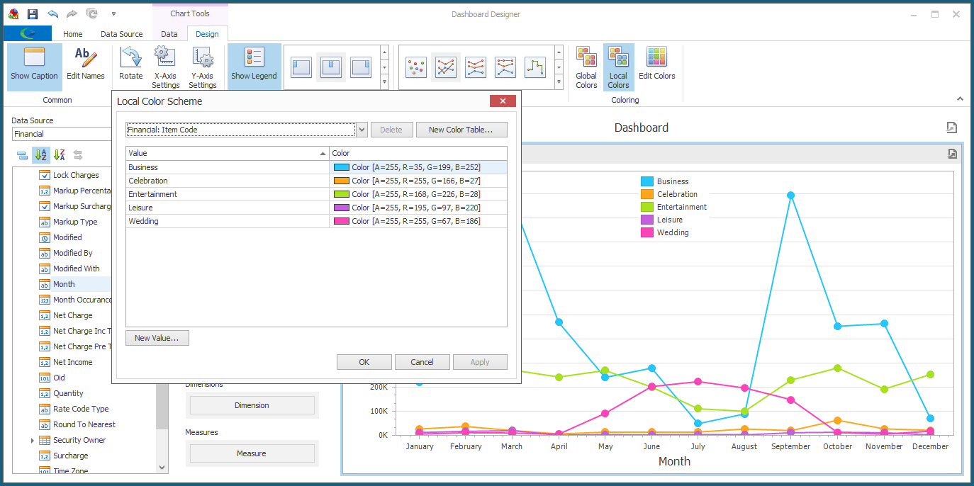
d.Coloring: To review how to change the coloring of a Dashboard Item, see Edit Color Schemes.
8.Make any other changes you require for your chart, referring back to Edit Dashboard Item and Design Dashboard Item.
9.Ensure that you Save your changes before exiting the Dashboard Designer.