1.Click the Gauges button to add a new Gauge to the designing area.
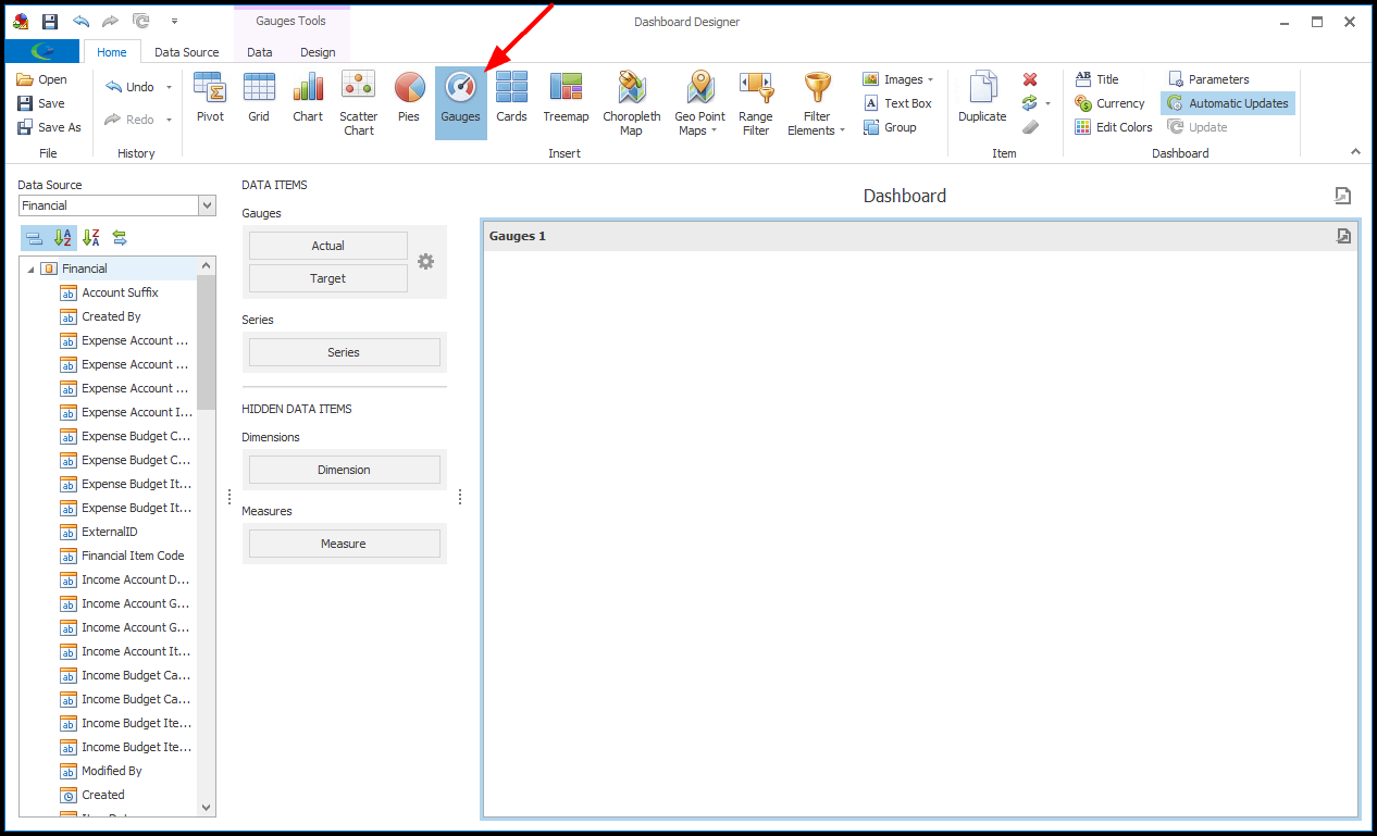
2.Next, we will bind the Gauge to data.
a.A Gauge has two data items: Actual, containing actual data, and Target (optional), containing target data.
b.In this example, we will use the Gauge to track our actual Net Income, without yet adding a Target value.
c.Drag-and-drop the Net Income field onto the Actual Data Item under Gauges.
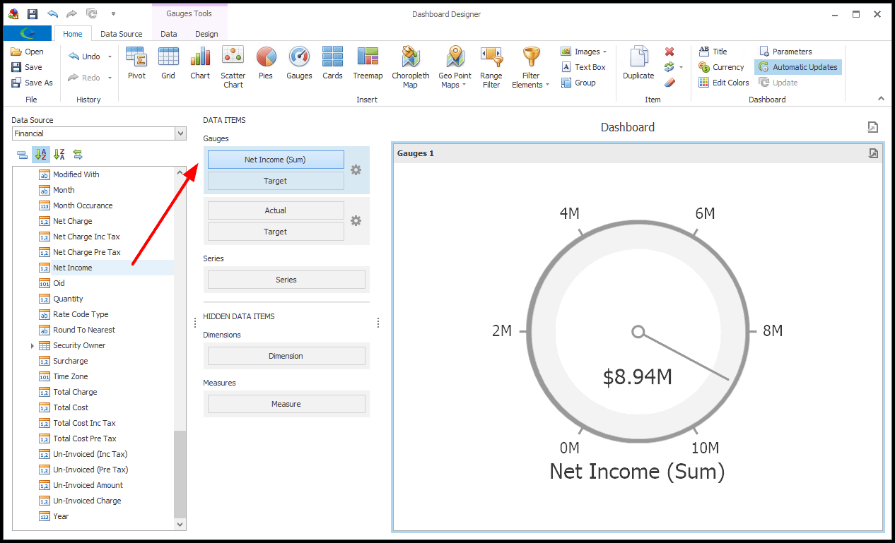
3.The Gauge will automatically determine the Minimum Value to Maximum Value range of the scale based on the values displayed.
You can, however, override the defaults if you want to manually set a minimum or maximum value.
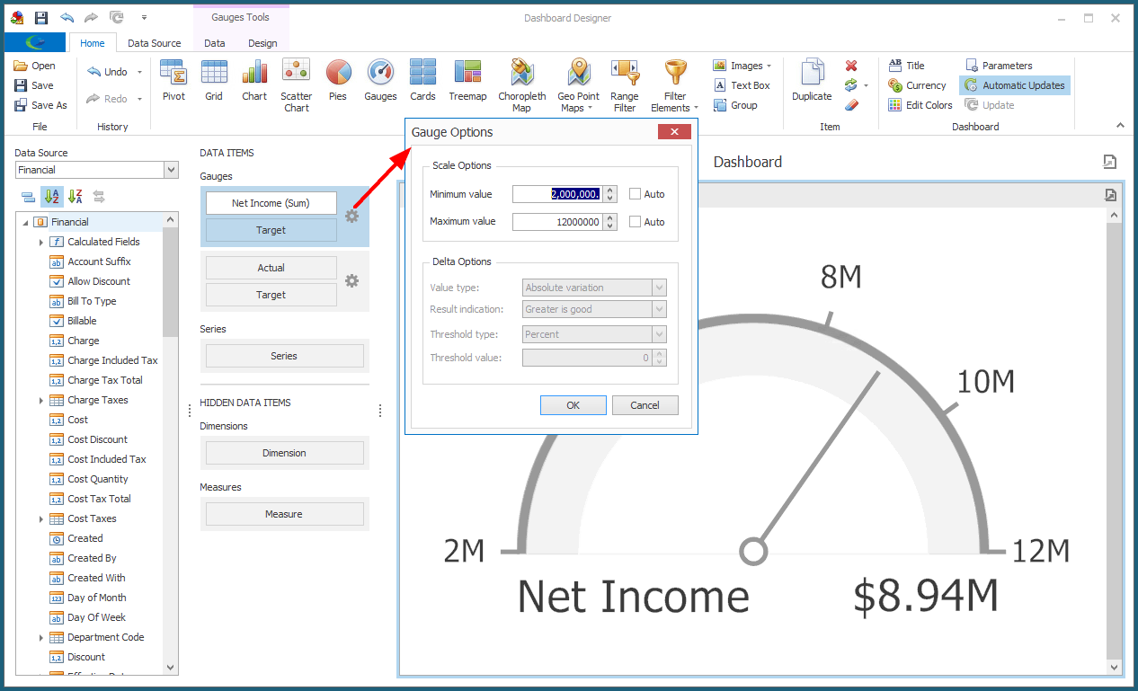
a.Click the gear icon next to the Actual/Net Income data item.
b.The Gauge Options dialog appears.
c.To override the automatic defaults, unselect the "Auto" checkbox next to the Minimum Value and/or Maximum Value.
d.Enter the value you want to use for the Minimum Value and/or Maximum Value.
IMPORTANT: Remember that the Dashboard Designer may not be displaying the full total for Net Income (Sum), depending on the the Dashboard's Max Records Loaded in Designer setting. If the Dashboard Designer is only loading a limited number of data records, the Net Income (Sum) preview displayed in the Designer will not be the actual Net Income (Sum) calculated from all data records.
Therefore, make sure that you are setting Maximum/Minimum Values relative to the actual Net Income (Sum), not a limited preview.
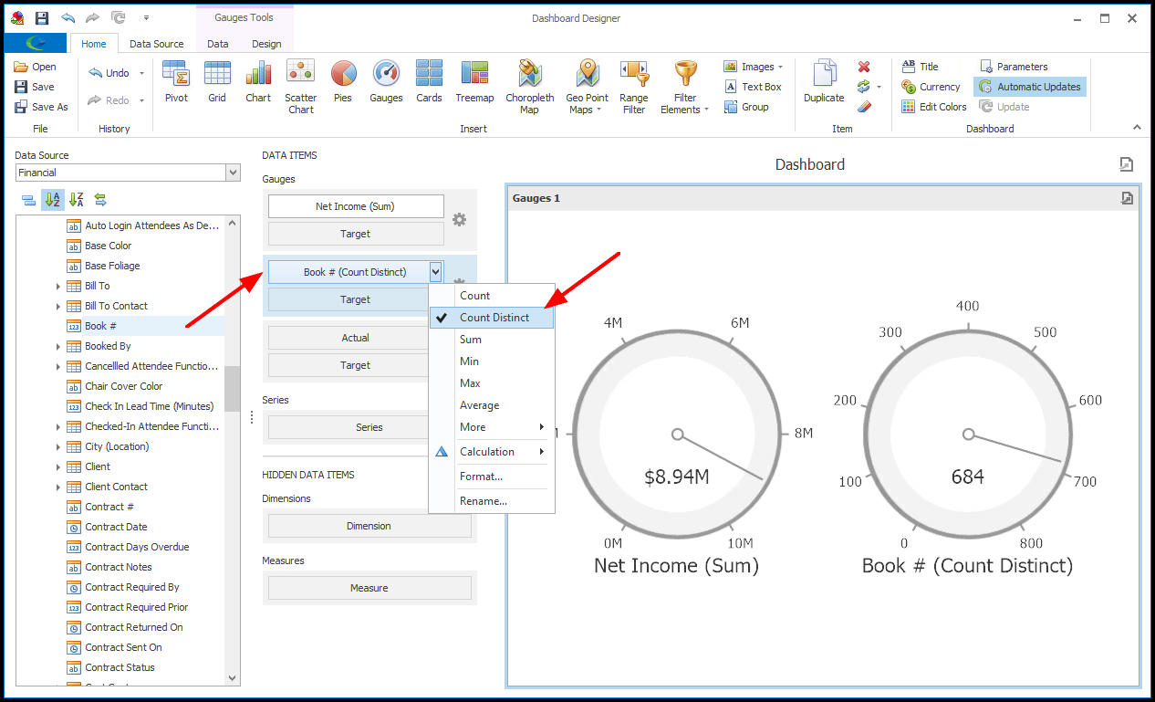
4.We are now going to add a second gauge in this same Gauge Dashboard Item.
a.Our second gauge is going to track the number of event bookings at our facility.
As with the Net Income gauge, we will monitor the number of actual bookings, but not yet add a Target value for comparison.
b.Drag-and-drop the Linked Event > Book # field onto the second Actual data item under Gauges.
c.By default, the Sum operator is used, but that doesn't make sense for Booking Numbers, as we actually want to count up the number of individual bookings.
We therefore need to select a different summary function type (review Shape, Format & Filter Data).
d.Open the drop-down menu next to the Book # Data Item, and select Count Distinct.
5.We will now go to the Design tab of the top ribbon, where we can access Design Tools for the Gauges.
As you will recall from Design Dashboard Item, the Design Tools will vary depending on the type of Dashboard Item, although Show Caption and Edit Names will be common to most types.
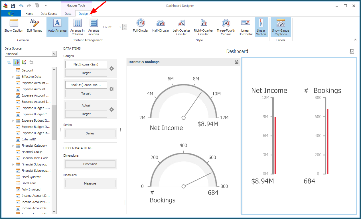
a.Content Arrangement: If there are multiple gauges in the Dashboard Item, you can choose how you want them arranged.
i.In the Content Arrangement section, you can choose to Auto Arrange, Arrange in Columns, or Arrange in Rows.
ii.If you select Arrange in Columns or Arrange in Rows, enter the number of columns/rows you want in the Count field.
b.Style: Choose the Style you want to apply to the Gauges in the selected Dashboard Item: Full Circular, Half-Circular, Left-Quarter Circular, Right-Quarter Circular, Three-Fourth Circular, Linear Horizontal, or Linear Vertical.
c.Labels: Click the Show Gauge Captions toggle to show/hide the captions for the individual Gauges in the Gauge Dashboard Item.
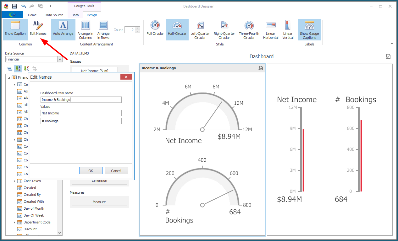
6.To change the captions of the Gauge and Values, review the instructions under Design Dashboard Item.
7.We have completed our Gauges.
If you want to make any other adjustments to the Gauge Dashboard Item, review the instructions under Edit Dashboard Item and Design Dashboard Item.
8.Ensure that you Save your changes before exiting the Dashboard Designer.